
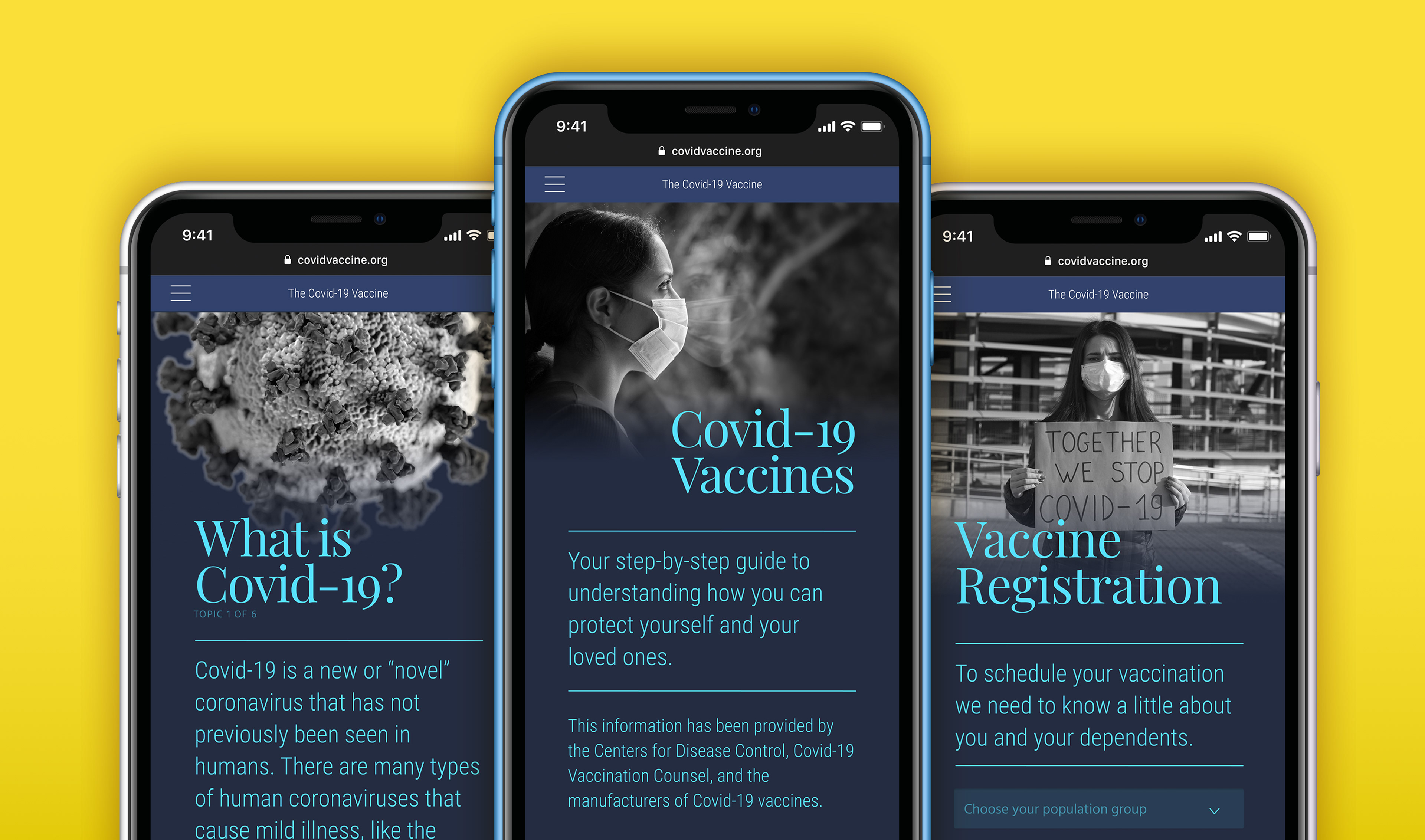
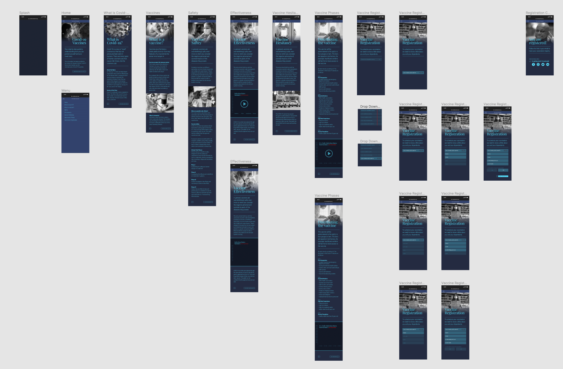
Vaccine HESITANCY and Covid-19 Vaccines
Vaccine hesitancy is a real and growing problem. Misinformation, fear, and politicization are contributing factors that prevent people from vaccinating themselves and their dependents. The following concept-site was designed to address this issue and by providing information regarding Covid-19 vaccines in a clear, straight-forward manner.
Case Study
Problem: How do we deal with vaccine hesitancy when Covid-19 vaccines are available?
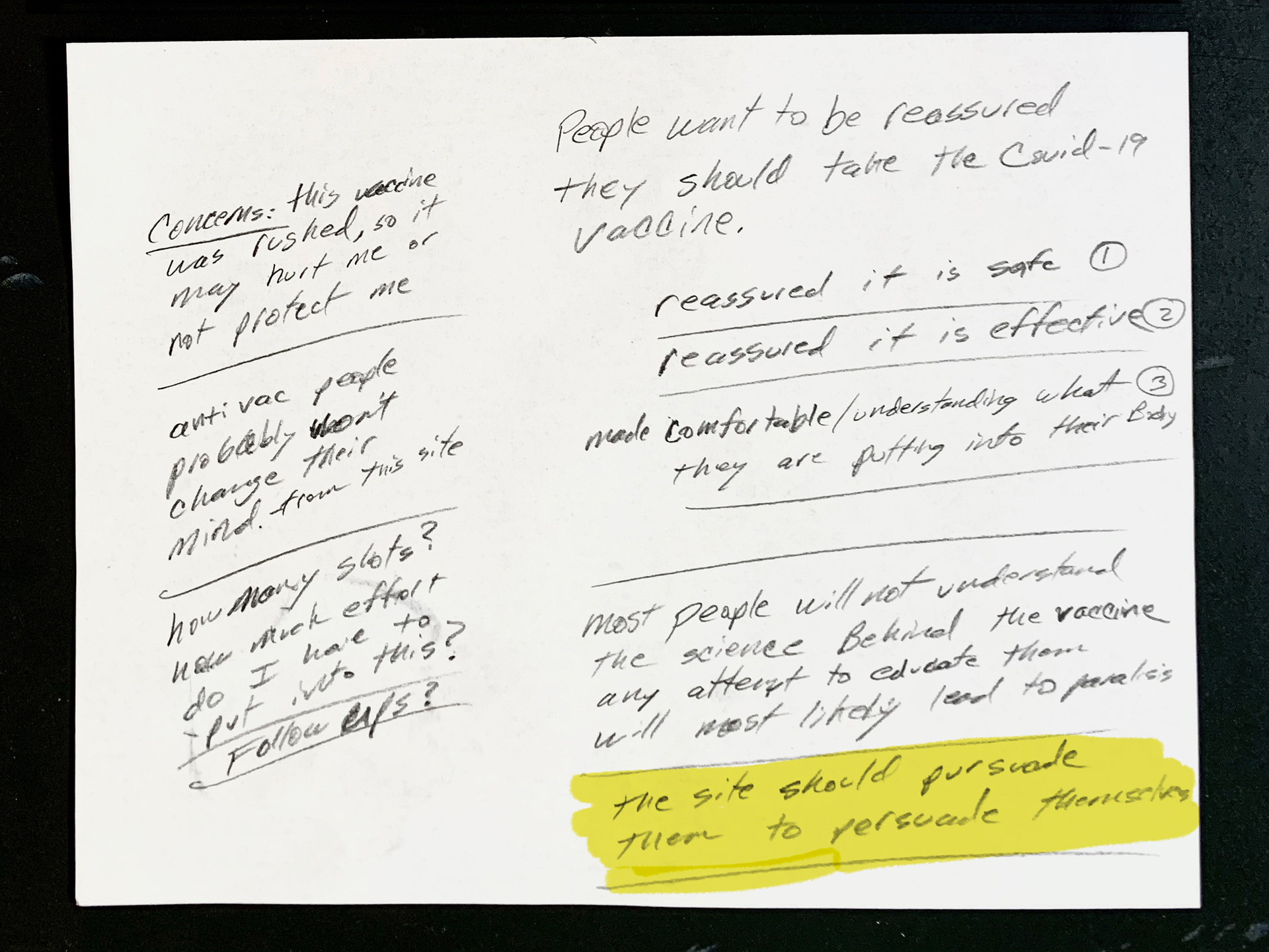
Hypothesis: Users need a rational, reassuring source of information about the disease and the vaccine. This resource can answer questions and provide a general understanding so users can feel comfortable and confident in their decision.
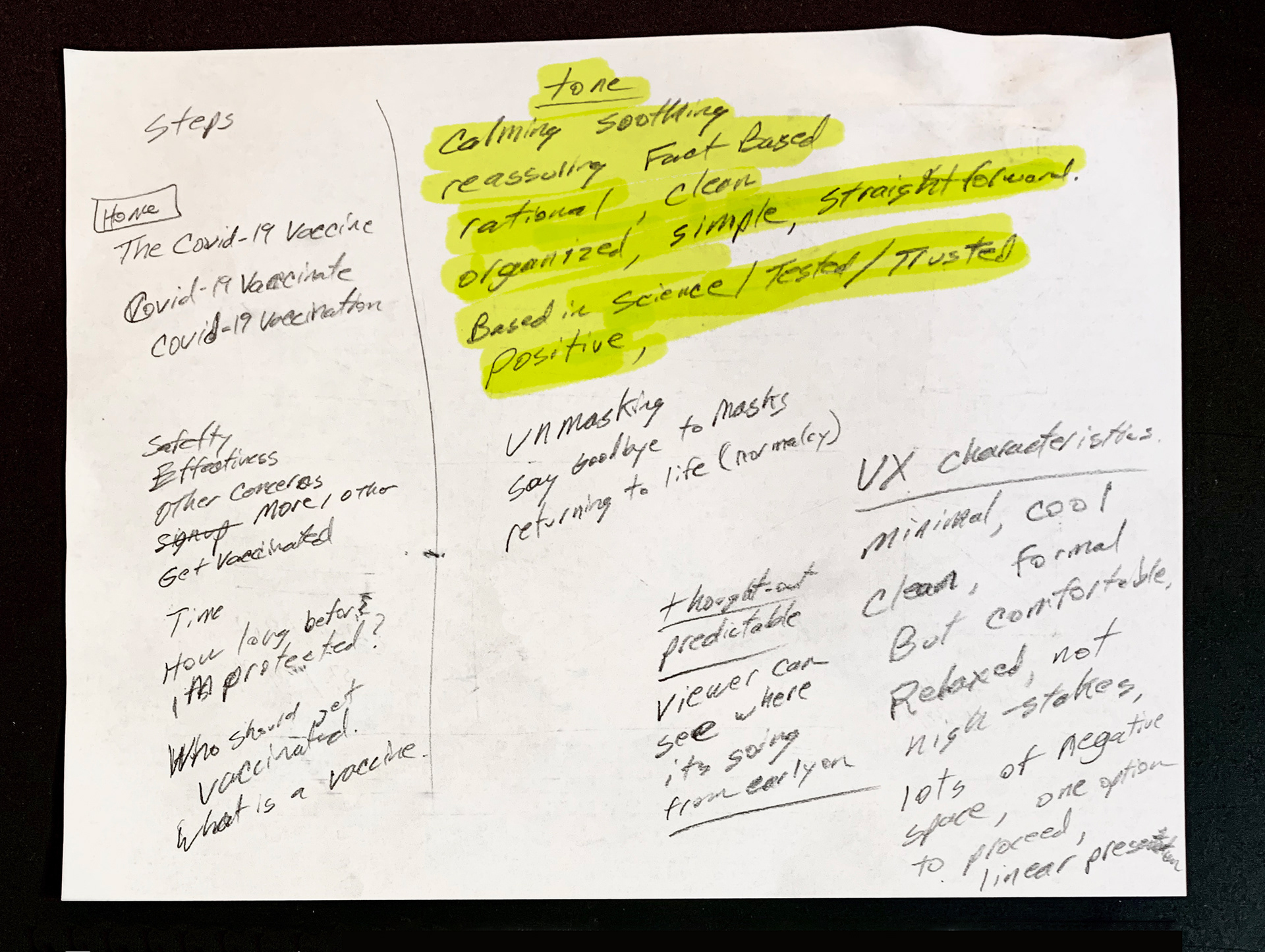
Environment: Making decisions about one's healthcare is of utmost importance. It should be conducted in an environment that is calm, reasonable, and grounded in fact with rigorously-tested scientific findings. This environment should be free of political spin, misinformation, and baseless rumors.
Content: When deciding on the content delivered through the site I researched many different kinds of resources like governmental sites, scientific news sites, and healthcare provider sites. I distilled the information down to the key topics or touch-points user's deal with regarding the disease and vaccination. Each step along this journey is crafted to address user's general understanding and possible apprehensions. At the end, I wanted to provide a way for users to take action. That is why I concluded the site with a vaccine registry that would capitalize on the user's mental momentum and provide a satisfying conclusion.
Creative/Art Direction: When deciding on the overall art direction for this site I thought the copywriting style, typography, photography, and data-visualization would be key to aiding the user's decision making process.
The writing style would need to be written in a patient-oriented voice that would not does not get delve into scientific minutia. The typography would need to be rationally presented and aid in absorption of the information presented. In terms of imagery, I thought black and white photography in a journalistic style would resonate with users. Photos should have a serious, somberness to them that reflects the gravity of the pandemic. I also believed infographics and data-visualization would be friendly, consumable way of conveying large data sets.
Takeaways: I had no grandiose ideas that I was going to fundamentally change anyone's mind on this topic. An anti-vaxxer's stance is not going to be radically changed by this site. I knew the audience for a site like this was people who were simply considering vaccination but wanted some additional information to bolster or validate their personally-held notions about vaccines. Hopefully this site shows respect for the audience's intelligence and reverence for their healthcare decision making process.
Colophon: This prototype was created using Figma (link to interactive prototype). Much of the written information was sourced from the CDC, NIH, and the Mayo Clinic.
Interactive Motion Design
These elements were created using Rive. Click or hover over the artwork to experience the interactivity.
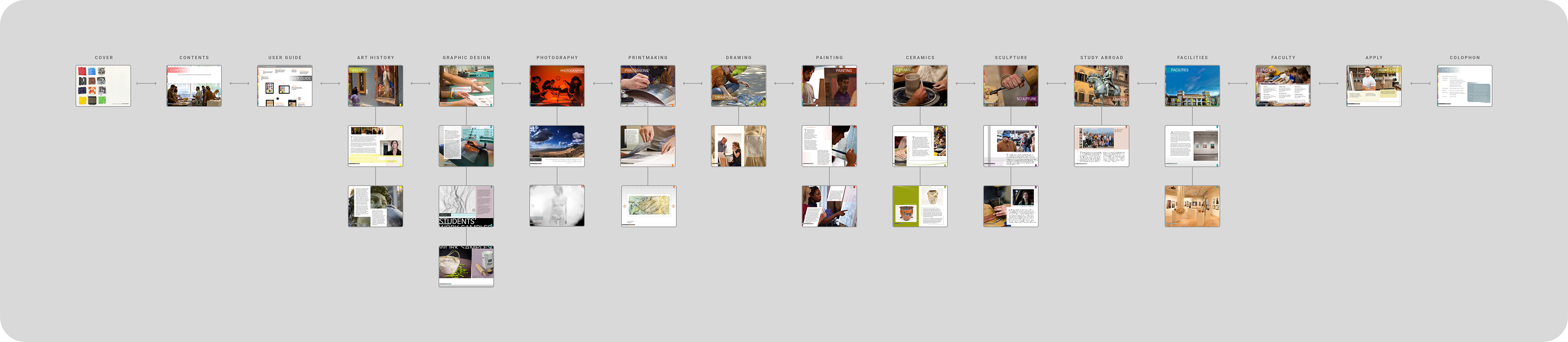
Lindenwood Art & Design iPad App
This magazine-style app was created to be engaging and explorative. Designed for prospective students interested in studying art or design, the app was full of interactive features including video, 360° imagery, slideshows, pan and zoom, etc. The app showcased the Art & Design program and gave viewers great insight to university facilities, faculty, and student work. Overall, it was an awesome experience; collaborating with faculty and students who created every aspect of the app. Our team designed and developed the app with Adobe's Digital Publishing System.
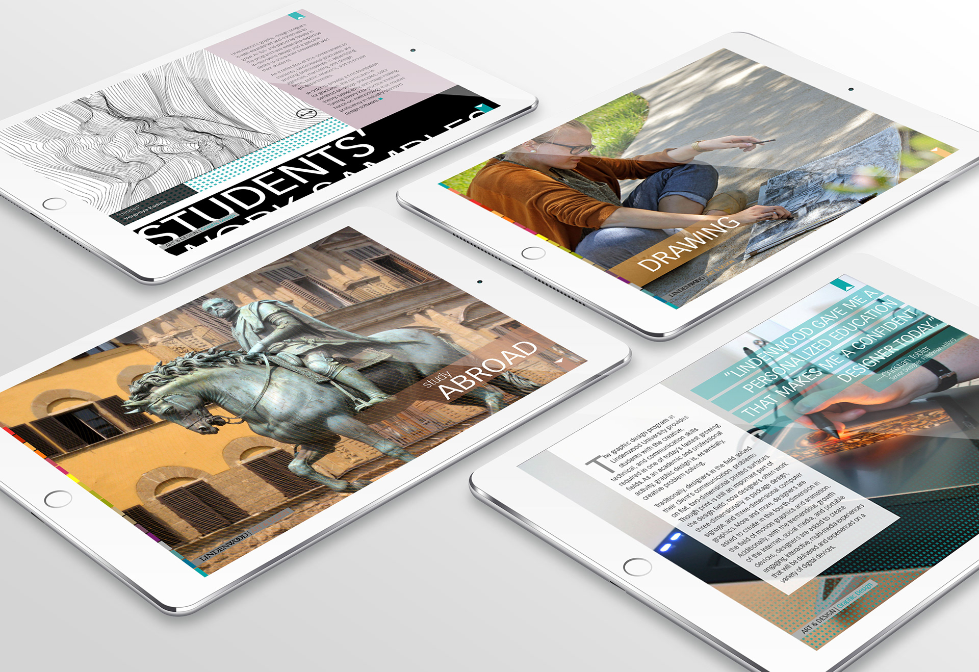
Overview of App Content and User Flow